The retail environment is arguably the most competitive environment of all. Products live or die based on consumer purchases and shelf-presence is crucial to that succeeding. Strong packaging has to position the brand in a clear and differentiated way that draws consumers in through strong shelf stand-out.
Creating strong and differentiated product branding and packaging design isn’t about being boldest.
The challenge for us with this superfood range was creating a brand name and identity from the ground-up in an already crowded food supplement marketplace and appeal, in the main, to female customers. We conducted thorough market research into the health food market and reviewed established products the new brand would be competing with.
A complete branding solution across packaging, web and marketing communications.
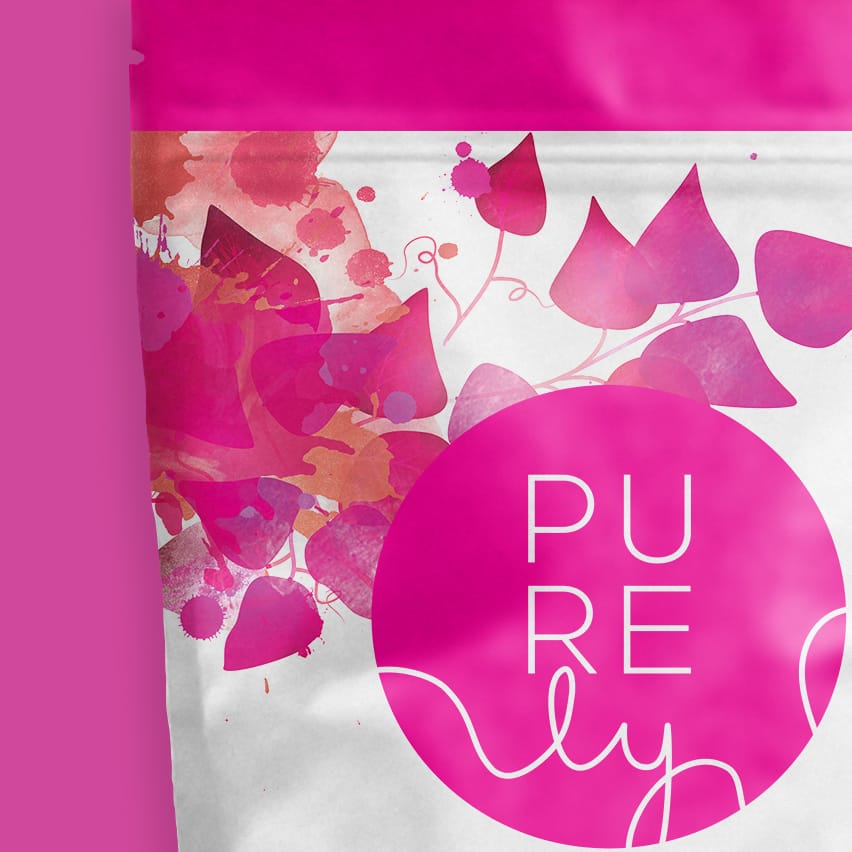
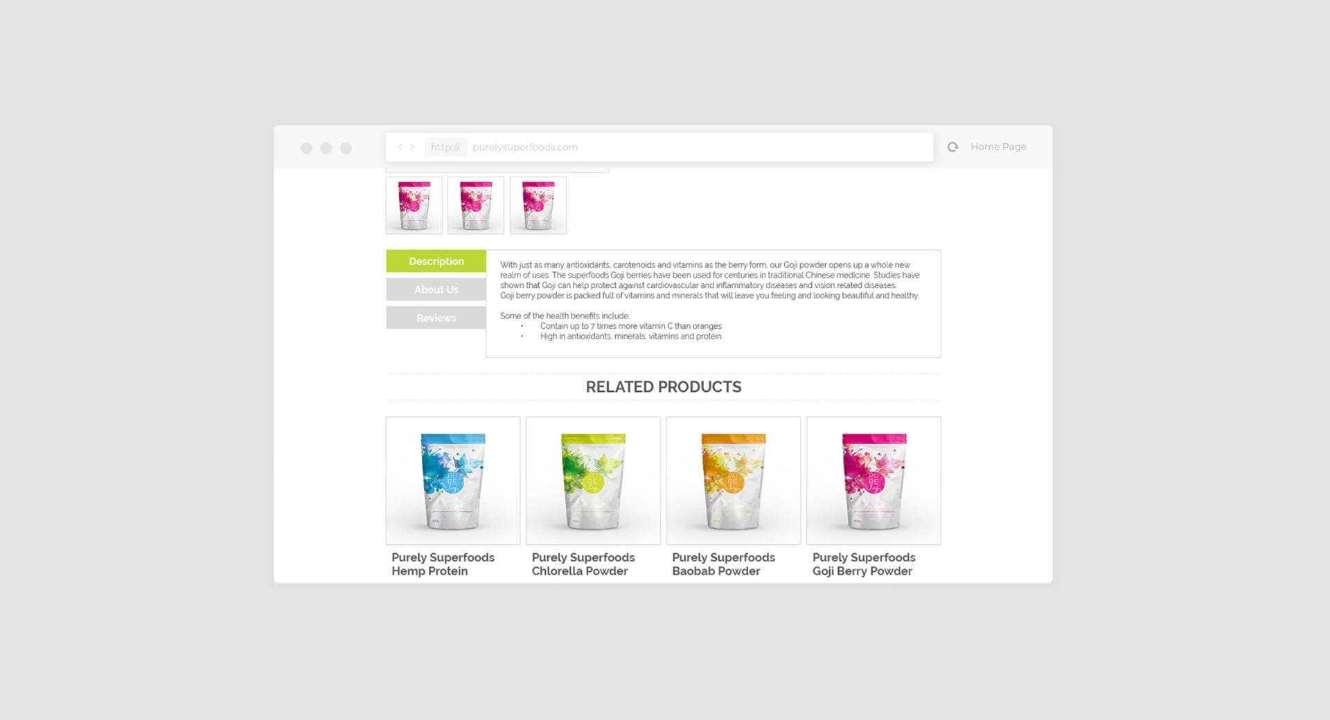
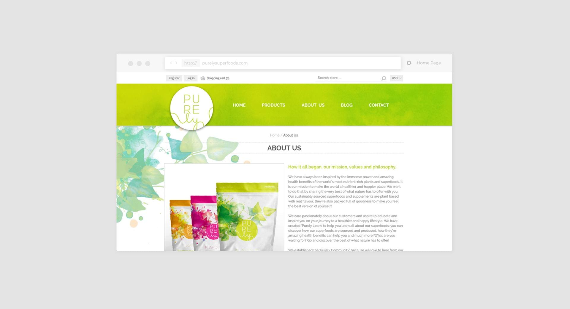
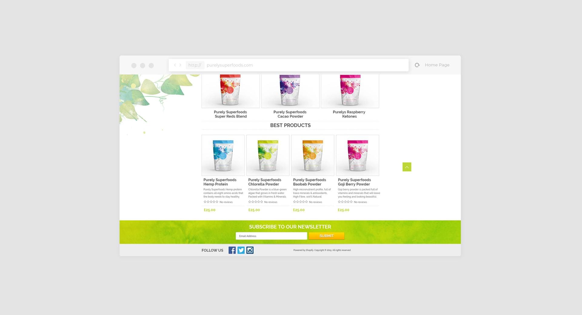
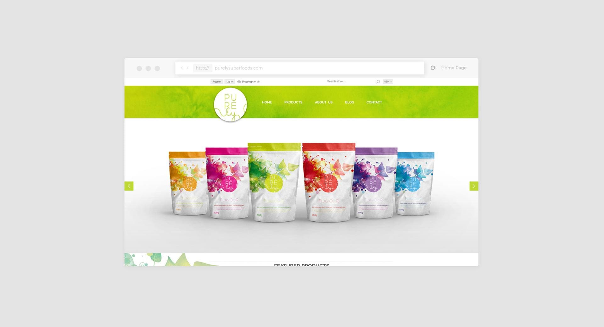
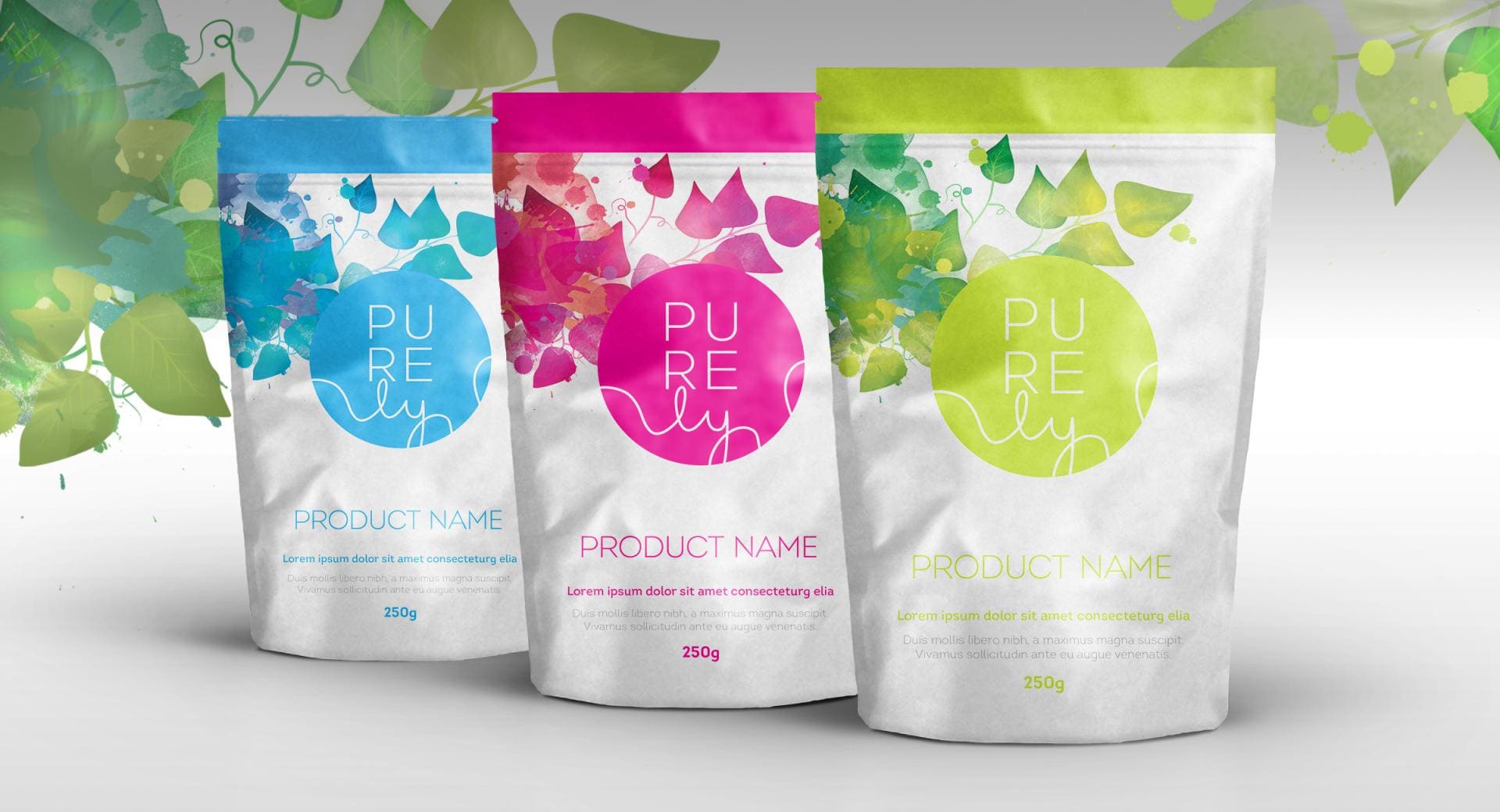
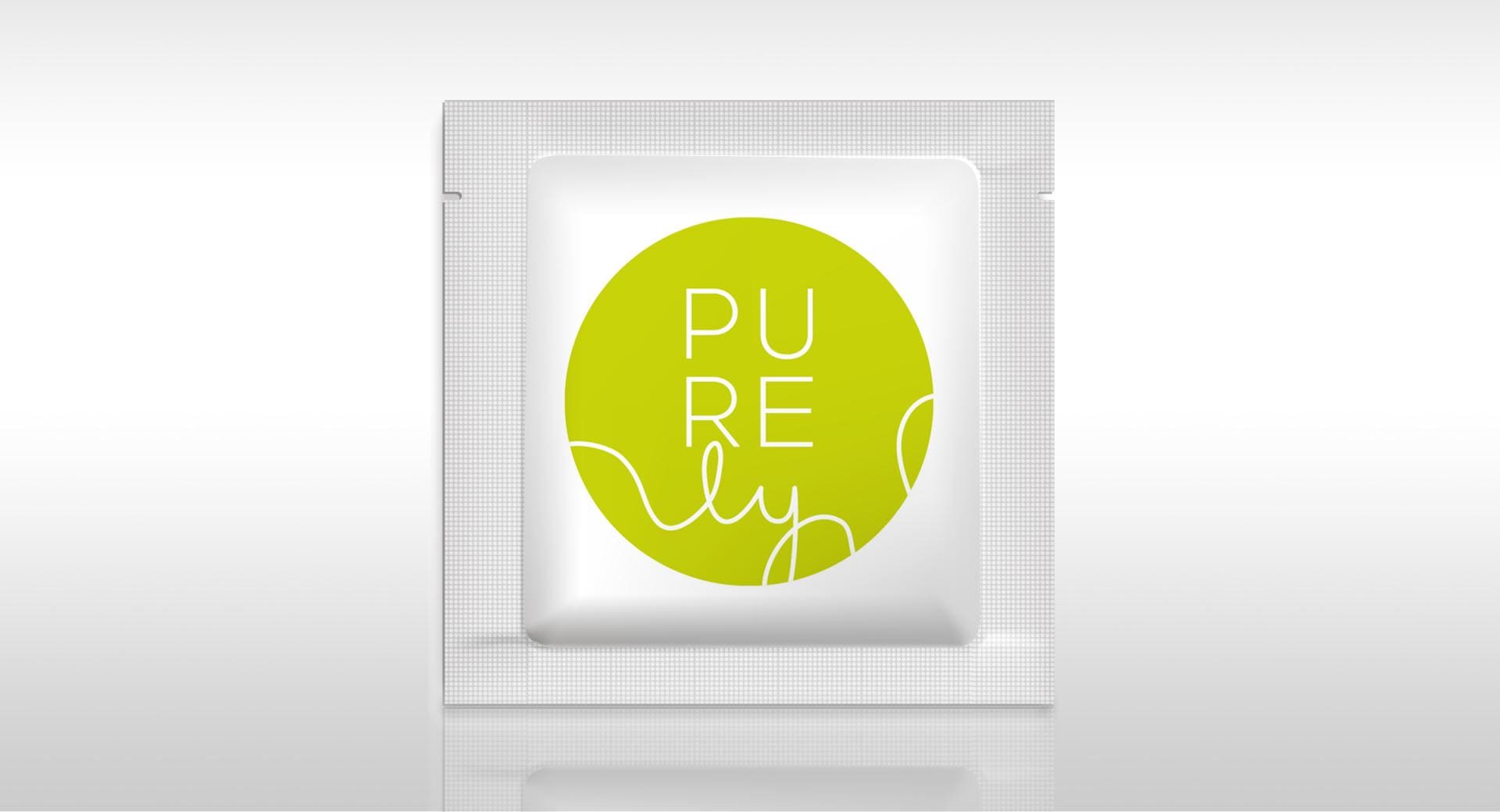
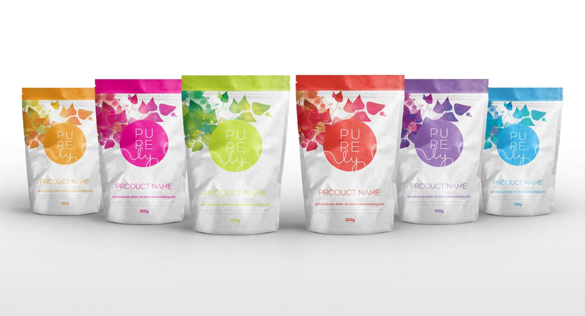
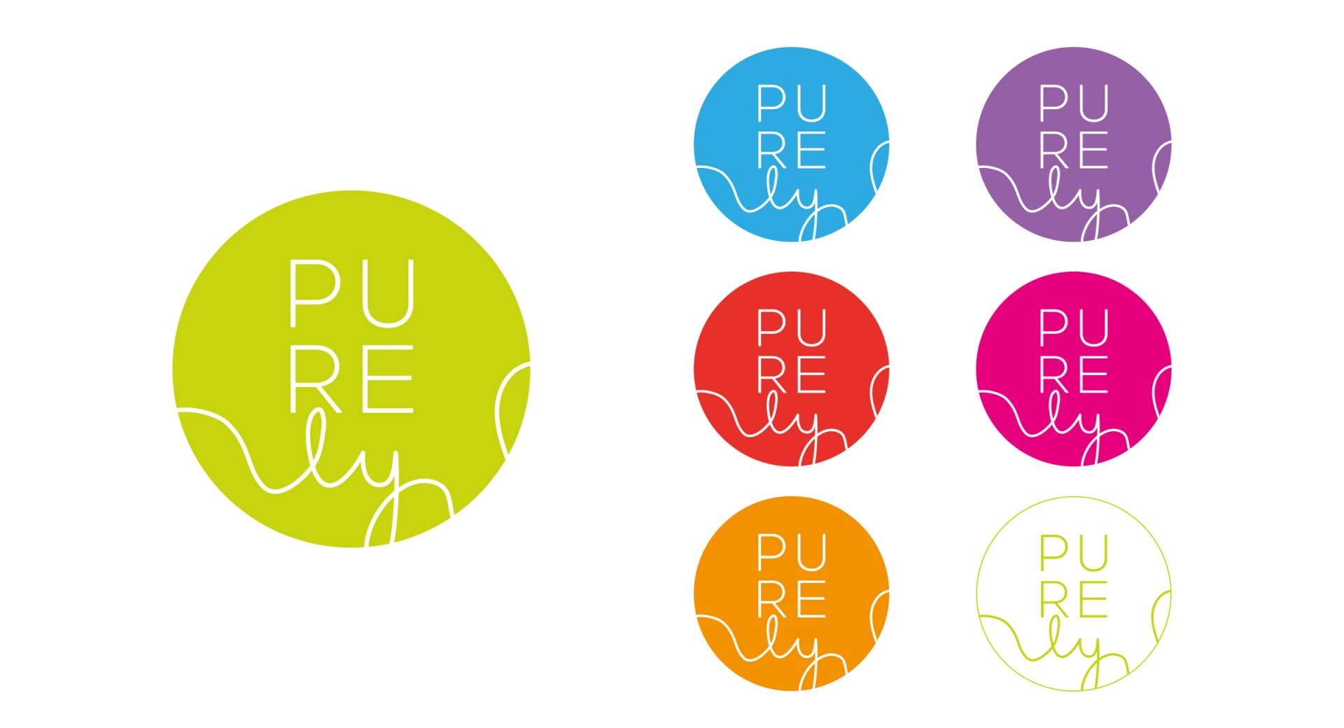
Among a number of naming ideas put forward to the client, “Purely” was the clear winner. Around the new name, we then designed a clean and bright identity plus over-arching brand image to cut through the noise in this crowded space. We designed a distinctive e-commerce template specifically for the Shopify system and produced design guidelines and artwork for various packaging from small 26g pouches, to larger packets and containers.
Brand image and styling for a fledgling product range.
The result was a new, distinctive brand that stands apart from its competitors in both image and style; something clean and bright to cut through the noise.
 PREVIOUS CASE STUDY
 NEXT CASE STUDY