
Discover how TFA developed Open SU’s new visual identity through a collaborative process, incorporating mass surveys, focus groups, and a progressive opinion filter to ensure broad audience input.
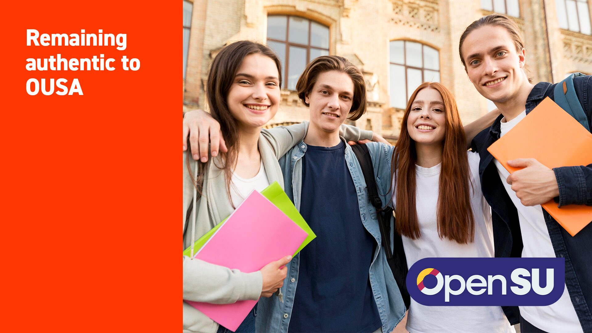

Remaining Authentic to OUSA
The Open University Student Association (OUSA) is on a mission to make a difference, and empower a student voice that represents the diversity of all members, as well as enhancing the overall student experience. But a lack of clarity around the meaning of the name and the function of the entity itself was felt by their leadership. TFA was set to start the rebranding process whilst staying true to Open SU’s mission and values.
Essential Rebrand Phases
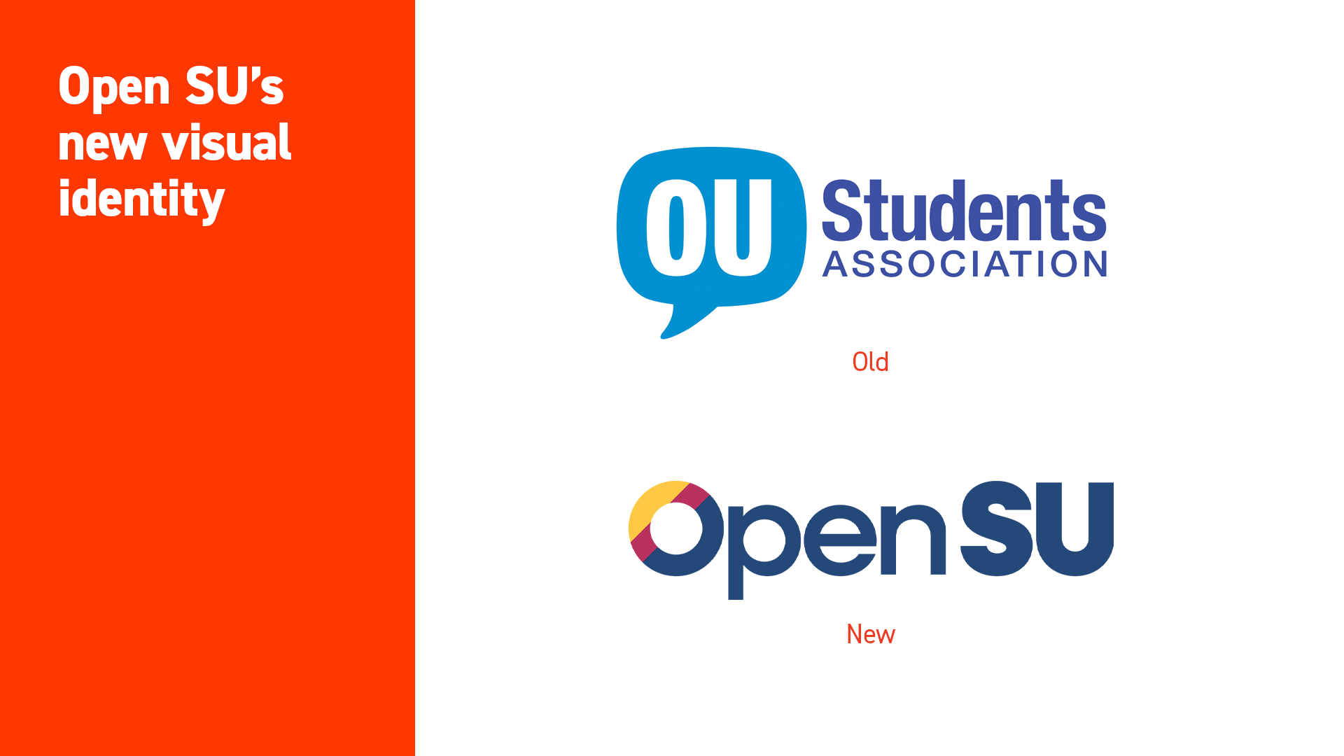
This process began with Phase 1, which involved the renaming of ‘OUSA’ to ‘OpenSU’. It was agreed that this decision was the clearest way to establish the Student Association (now a student “union”) as part of Open University and bring clarity to their audience.
Phase 2 focused on developing a new visual identity and logo.
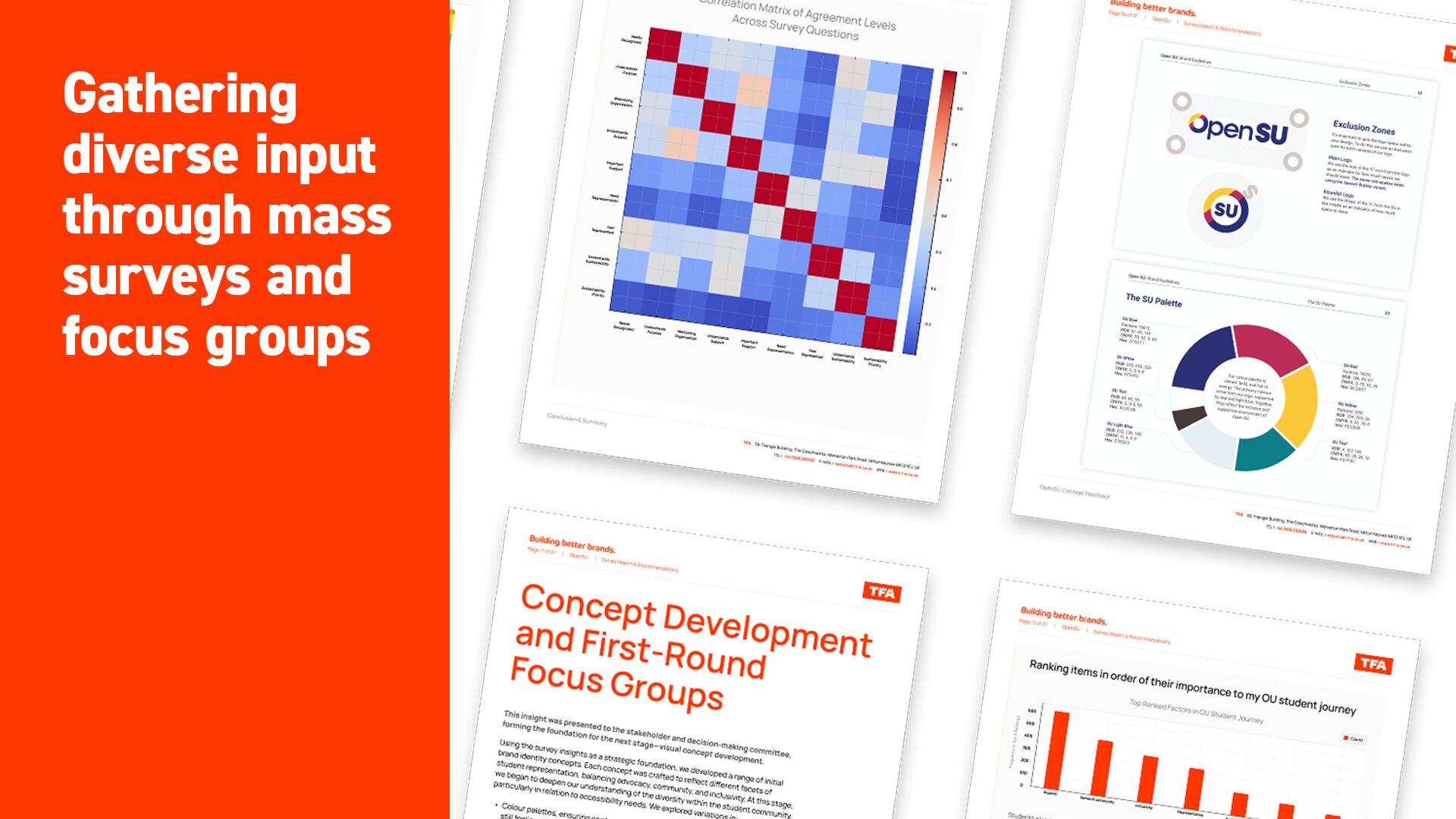
The first stage of this visual refresh was a discussion with the stakeholders to discover what they specifically liked and thought was missing from the logo designs. With this information, our team considered colour sensitivity, and how colour variations might be perceived by different audiences. This extensive research moved forward our logo designs and created a palette that would be perceived calmly, without visual overstimulation.
In the last stage of this phase TFA conducted mass surveys and focus groups to gather diverse input. This broad engagement helped shape the creative direction by introducing the perspectives of a large audience. The surveys gathered as many opinions as possible, and asked about experiences that mattered most to members of the student union; this helped us to reflect these authentic experiences in the new identity.
Our team can say with confidence that the rebrand has been built off the genuine experiences and opinions of members of the Open SU.
The final phase of the rebrand brought everything together into a cohesive identity. This comprehensive package included a complete set of brand guidelines and a distinct brand voice. Carefully curated imagery and iconography were introduced to reinforce the brand’s unique personality and story. To ensure consistency across all touchpoints, we also developed essential collateral, including a standardised email signature and a professional letterhead design. Together, these elements formed a unified brand presence, ready to be confidently launched across all channels
Strengthening OpenSU’s Identity
OpenSU’s new visual identity has now officially been launched, providing students with a brand that represents real student experiences. Open SU can now function and be recognised as a solid student union that exists to support students, amplify their voices and advocate for their well-being, both academically and personally.
Does your business need help to develop brand presence and consistency? TFA can provide you with a distinct logo and a marketing strategy that represents your true brand values. Get in touch with us today if you believe your brand needs a refresh.
 PREVIOUS CASE STUDY
 NEXT CASE STUDY